Global Health Indicators Dashboard
This project is a live, deployed application. The screenshot below is a preview; use the launch button to open the interactive dashboard.
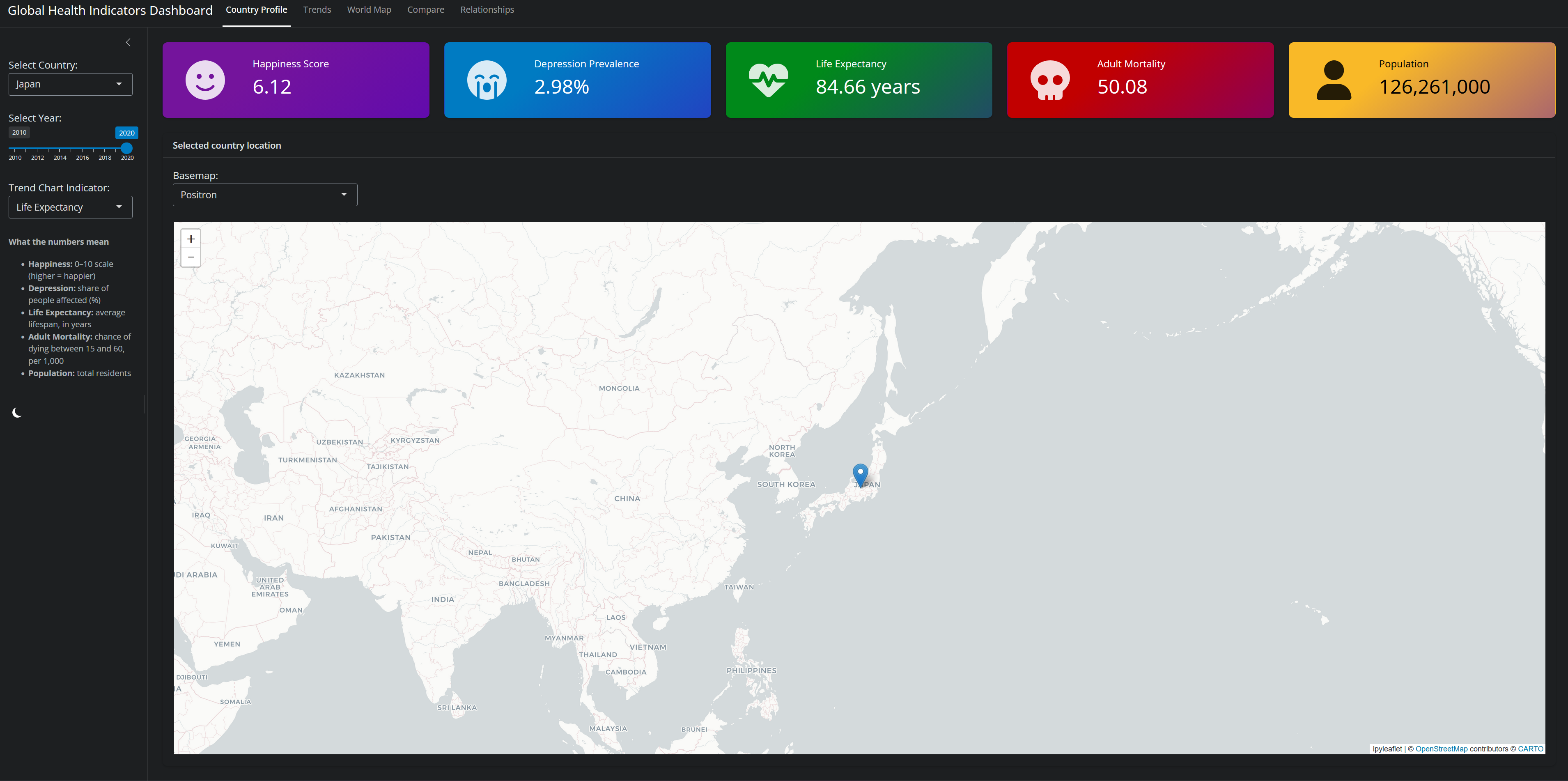
(The app is hosted on shinyapps.io’s free tier and may take a few seconds to wake if it has been idle.)
Overview
I built this dashboard to make a decade of global health data explorable in one place. It brings together five indicators, happiness, depression prevalence, life expectancy, adult mortality, and population, and lets you move between a single country, the whole world, and direct country-to-country comparisons. The goal was a tool that answers real questions: Is this country getting healthier over time? How does it compare to its neighbors? Which indicators actually move together?
The data
The underlying dataset is a unified country-year panel, 2,398 observations spanning 219 countries from 2010 to 2020, assembled from four public sources: the World Happiness Report (happiness), the World Bank (population and adult mortality), the WHO (life expectancy), and IHME (depression prevalence). The bulk of the work was reconciliation. The same country appears under different names and codes across sources, so I standardized names and ISO-3 codes before merging.
Data validation surfaced the most interesting catch of the project. The mortality column carried values around 50 to 680, which looked far too high for a simple annual death rate. Benchmarking specific countries against published figures (Japan ≈ 50, the United States ≈ 109, Lesotho ≈ 600) confirmed the series was actually the World Bank adult mortality rate, the probability that a 15-year-old dies before age 60, per 1,000, not deaths per year. I relabeled it accurately throughout the app. The lesson stuck: a value that “looks wrong” is often a definition problem, not a data problem.
What you can do
The dashboard is organized into five tabs, each owning its own view.
- Country Profile. Current indicator values for a selected country and year, alongside a location map.
- Trends. One indicator’s path across the decade for a single country, with the selected year highlighted.
- World Map. A choropleth shading every country by the chosen indicator and year.
- Compare. Overlaid trend lines for several countries at once.
- Relationships. A scatter of any two indicators across all countries, with bubble size encoding population, an OLS trend line, and the Pearson correlation. (Life expectancy versus adult mortality lands at r ≈ −0.93, exactly as epidemiology would predict.)
Under the hood
The app uses Python Shiny’s reactive model, with a single source of truth for the selected country that the dropdown and views all read from. Charts are built with Plotly and are theme-aware, so they re-render correctly when you toggle dark and light mode. Accessibility shaped several choices: a colorblind-safe (Okabe-Ito) palette for the comparison lines, high-contrast tooltips, and indicator definitions surfaced both on first load and in the sidebar so the numbers are never a mystery.
A key reliability decision was removing live geocoding. An earlier version called an external geocoding service at startup and on every interaction, which made the app slow and prone to failure when the service rate-limited it. I replaced it with a static country-coordinate lookup, eliminating the network dependency entirely. The app now starts instantly and cannot hang.
This is the piece of my portfolio that demonstrates I can ship, not just analyze: an end-to-end Python application taken from four messy source files all the way to a deployed, publicly accessible tool, including the un-glamorous reliability work that keeps it standing up.
Tech stack
Python · Shiny for Python · Plotly · pandas · NumPy · ipyleaflet · shinywidgets · deployed on shinyapps.io
Explore it live
The most honest way to evaluate an interactive tool is to use it.
Or preview it embedded here (may be slow to load if the app is idle)
Links
- 🚀 Live dashboard is the deployed PyShiny application
- 💻 Code on GitHub
- 🗄️ Data sources: World Happiness Report, World Bank, WHO, IHME